|
|
|
|
|
|
||
|
|
|
|
|
 |
gathering data to test global warminga briefing document |
||
|
|
|||
| on energy | on global warming | |||
| sustainable futures briefing documents |
Tectonics: tectonic plates - floating on the surface of a cauldron |
|||
|
||
tracking and measuring global warming is not as easy as cribbageAlmost every day, articles and claims are made that this proves or disproves global warming, written or made by people who have not the slightest idea of how complex the studies are. Below, in sections 3 and 4, I refer to two local studies which, as you will see, are being widely confused with ‘global warming’, pro or con. What is particularly amazing is the incredible dogmatism of the ignorant writers of these items. Yet more examples of the arrogance of ignorance. The next section gives some idea of the complexity of these studies, both parts being taken from today. Then we have a claim for a localised study in America, this week’s extreme example of the “it ain’t happening” tendency purporting to be global. Next there is an Asia-local example, which makes the contrary claim with the same error. the complexity of global warming studies
There are also claims around that nitrogen availability will have the reverse effect, and increase carbon uptake by plants.
And here is an example of what modern global measurement can do:
confusing local and global dataThe nonsensically titled “Revised Temp Data Reduces Global Warming Fever” is a particularly egregious example from an extremist site. Note that, in this article, the corrections referred to are only corrections to a USA limited, land level-based series. This is not global. (The USA is 1/50th of the world’s area, so is a ‘local’ planet area.) Also note that the article is describing how one lot of fudge factors have been replaced by another set, this time called ‘adjustments’.
The error was picked up by observing the discontinuity in the data, always a red flag that something needs careful checking. In this case, a Y2K error was identified. Despite widespread exaggeration, not only was this an extremely local and not very reliable data series, the correction amounted to approximately one one-hundredth of a degree over the most recent years! Such corrections are very common. For example, there was an earlier problem where deniers claimed that satellite measurements were not consistent with warming. These claims were found to be in error because the changes in satellite distance had been incorrectly assessed. This is not ‘exact’ science, but we are gathering better data from year to year, including such corrections as reported here. The consensus remains there is AGW.
|
|
|
james hansen on jesters (useful fools) and irresponsible ceos This 5-page .pdf includes details on NASA US data adjustment and global
warming maps.
|
on temperature and statisticsanother step to understanding antarctica
The map and text in the above item are unclear to the point of sloppy. Here is a more secure link from NASA Earth Observatory.
related material measuring temperatures - differences in method led to differences in temperature
related material on temperature and statistics - commentaryIt is useful to recognise that there is no such thing as temperature outside of a real-world context. In general, if you put a thermometer into a glass of water, it will register a reading. That reading is due to the amount of energy in the molecules of water bouncing around. If the water is heated, the molecules bounce around more quickly and the increased energy is registered as a ‘rise in temperature’. Now consider the glass of water. Despite appearances, it does not have a single temperature, but the temperature varies somewhat from place to place in the glass. As the temperature rises, this becomes more apparent, as can be seen in a pan of water roiling as it is boiling. Any temperature measuring device is, in fact, integrating an average measurement over time. This measurement, you may register as accurately as your eyes or measuring devices can discern. Measuring global temperature is a far more complex process, requiring measurements from all around the world and at many depths - from the top of the atmosphere to deep in the oceans, and even into the Earth. Even this is complicated by the fact that the interior of the Earth also generates heat [see comment at geothermal briefing document]. Choosing the definition for global temperature is no simple task. What statistical weight to do you give to land, to the atmosphere, or to the seas? Almost every day, I see reports confusing global with local temperatures which are, of course, also averages.
Recently, I have seen several reports suggesting that La Niña will cause a hiatus in the rises of global temperatures [black line]. However, if you look at the longer-term temperature predictions, you will see that the hiatus [green line] returns to trend line over a few years. In other words, it is not a slowing in global temperature rise, but merely an artefact of the way in which that particular temperature average is being calculated. Note, our measuring sophistication is growing rapidly, as are our technical means of obtaining local temperature samples (in this case, a sample means a single measurement). We now have satellites, ever-improving instrumentation and the means to put sensors in remote places. It is important to realise that our historic data and temperature surrogates are not as usefully reliable as the latest satellite measurements. There, millions of readings can be taken daily, and the data (and the processing of that data by ever more powerful computers) is of a far higher order than the recordings made by some enthusiast. Such an enthusiast may have lived fifty or a hundred years ago in a city heat island, in a more advanced country, and without having available measurements from the poles, the broad oceans, or darkest Africa. It is critical to understand that today’s average does not necessarily correspond to an average designed and defined fifty years ago. Notice above, the contrast between the sloppy definitions in the first item, and compare them with the rather better definitions in the second item. related material the present stage of global temperature measurementWhile reading this section, keep always in mind that in climate science (as with all else complex) the system being examined is dynamic. That is, the system, and even the conditions under which it is being measured, are changing as you try to measure it.
I was once amazed when I asked a very capable botanist what a particular flower was. It looked to me like a typical garden variety. I was told it was a common meadow flower (weed!?). I said it was nothing like the flowers I’d seen under that name - the one in the garden was at least twice as high and the flowers at least two or three times the size I was informed that the difference was solely down to better soil and fertilisers and attention. Soil varies over a few feet, the flower had been taken from a nearby flood plain field. Trees a few metres apart can be in very different conditions, let alone on different continents. This science is about global warming, not the warming in some microclimate in a hollow in the Rockies and another in Siberia. The graph below has recently [December, 2009] been subject to much uninformed hysteria. What had been ‘hidden’ is data that clearly contradicts the best estimates of the global temperature as measured by satellites and weather stations. It is even possible that the increased ozone levels is slowing growth, as the plants adapt new conditions. There is also some evidence that rain forest trees grow more slowly during warmer periods, while temperate trees seem to grow faster with increasing CO2. Changing rain patterns alters growth rates.[1] And of course, in the meanwhile, evolution will force rapid adaptation under such pressures.
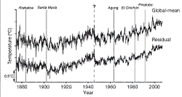
When reading the two quoted paragraphs above, it is important to attend closely to two factors. In paragraph 1, you will notice that the primary evidence for global warming is real-world [empiric] observations such as retreating glaciers, rising sea levels and, of course, readings from various forms of thermometer. In paragraph 2, you will see references to various forms of proxy/surrogate such as tree rings (and wood density), ice cores, historic documents and the like. These are secondary sources. It is vital to remember that these sources are usually very local. These sources are used as the best assessments of historic temperatures. All manner of ‘fiddles’ and weightings are applied to this type of data. Attempts are then made to average these sources of data out over the planet. Thus, tree ring data and so on will be sought from many areas, and then averaged according to best judgments/guesses. In a situation where we believe there to be relevant substantial temperature changes, it is very possible that a local climate may also change considerably over time. Thus, an area with a good growing season may move north or south as the weather systems change. Obviously, we must put much greater store by real temperatures than by guesses and estimates of past conditions divined using proxies. Remember, more modern actual measurements are best evidence. Hence, ‘hiding the data’ from a proxy, like tree rings in a local area, and giving preference to real, measured temperatures is the sane thing to do. The manner in which a tree will grow, the width of its rings, the density of its wood, may well change with varying local conditions. Further, the correlations with temperature are merely statistical and not fully modelled in causal terms. In the next graph, you will notice that each year’s temperature bar estimate [in red] is overlaid by what looks like a long letter ‘I’ [in black].That usually indicates that the probability is that we have a 95% ‘confidence’ that the real temperature fell between the two cross bars of the ‘I’. Notice that as you go further back in time, the range of uncertainty (the upright bar of the ‘I’) increases for obvious reasons. Sometimes, you will see such ranges of uncertainty indicated by ‘fans’, often giving more than one uncertainty level. This is especially common in graphs giving future forecasts in complex domains, like economics and climatology. [example graph]
on the fraudulent misuse of statistics by agw deniersSee
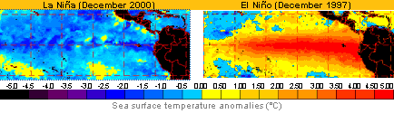
you think ‘the global temperature’ is simple?The system of ARGO probes is only recently active. They measure ocean temperature by duck diving, and then radio to satellite their GPS position and the local water temperature. The system involves 3000 points, with 5 levels going down progressively to 200 metres. The oceans are over 70% of the planetary surface that’s around 335 million sq kms. This means there is one measurement point for every 100,000 sq kms. Meanwhile, ice is pouring into the oceans at an increasing rate. this is even expected to effect the Atlantic Conveyor. The Atlantic Conveyor is a vast overturning current involving much deeper depths, possibly slowing and increasing the cold in the Atlantic. At the same time, the present La Niña is expected to cool some surface areas temporarily. computer modelsYou will hear people claiming that predictions of future temperature are ‘just computer models’. I hope by now that you will realise that they are no such thing. The forecasts are based on the best real data we have available this week, supplemented, as we go back in time, by ever more unreliable guesswork. A lot of the arithmetic for analysing and forecasting weather patterns was worked out in the early 20th century, but at that time, it took weeks of hand calculation to forecast just one day ahead. With the coming of computers, we can do far more calculations far more quickly. Hence, the increasing sophistication and reliability of weather forecasting. However, we can still only forecast a very few days ahead in the generality, and less so the finer the detail we seek, like for example the Cockermouth flood of autumn 2009, or a more general system such as Cyclone Klaus. And as always, we are dealing with forecasts, not hindsight. While we do not need such fine detail for long-term climate change, the methods used are very similar. As you see from the example above of the new oceanic survey measuring system, the cells being used are very large/crude. There is no ‘complete’ climate computer model. To gain one, you would need to measure cells down to the micro-level, not every 100,000 sq km - and still it would not be ‘complete’. So we do the best we can. At present, we simply do not have computers powerful enough to do useful modelling for the whole climate, even with our crude 100,000 sq km cells. We have to model parts of the climate and them attempt to meld them together. Hence, the continual requests for ever bigger and more expensive computers by the world’s prime climate research centres.
|
© abelard, 2007,26 march the address for this document is https://www.abelard.org/briefings/gathering_data_to_test_global_warming.php 2500 words |
| latest | abstracts | briefings | information | headlines | resources | interesting | about abelard |
 “One
of the wildcards of global warming is how fast the world's massive ice
sheets are melting. Efforts to measure the rate of melting on Greenland
and Antarctica--and thereby predict how fast sea levels will rise--are
complicated by something called "post-glacial rebound" of
the earth's crust. When the crust is relieved of its millennia-long
burden of ice, it shifts around a bit, and springs back.”
“One
of the wildcards of global warming is how fast the world's massive ice
sheets are melting. Efforts to measure the rate of melting on Greenland
and Antarctica--and thereby predict how fast sea levels will rise--are
complicated by something called "post-glacial rebound" of
the earth's crust. When the crust is relieved of its millennia-long
burden of ice, it shifts around a bit, and springs back.” carbon dioxide. Credit: AIRS Science Team, JPL, NASA")